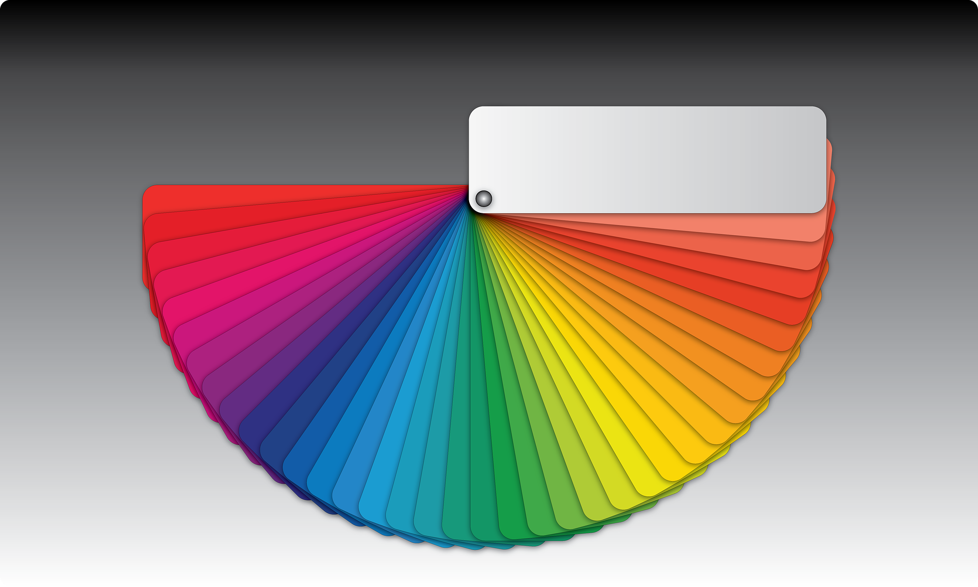
Colors evoke feelings. As children in art class, we learned to use reds, yellows and oranges to depict the warmed landscape in a sunny, beach day painting. Blues, greens and purples provided cool, refreshing tones of the water where children play.
More than just the sense of touch, colors elicit emotion as well. Red can make you feel excited, energetic and passionate. Green reminds of us good luck, nature, and renewal. Blue stands for peace, trust and confidence amongst others. Yellow is reminiscent of joy, happiness and optimism.
When crafting your online image, be conscious of the colors you choose to use in the design. Do not select your favorite color just because you like it. Ensure it evokes the image and feelings you want your personal brand to portray to the world.
Web sites, portfolios, blogs and social networking sites are integral portals of your brand. Each platform should create the same look and feel if possible. (Some social networking sites do not allow for design modifications.) Your site starts the communication process with design before a single word is read. Conflicting color usage confuses the viewer. As in all good relationships, clear communication is key—even visually. Keep your messages consistent and future clients will thank you.
Happy branding!


